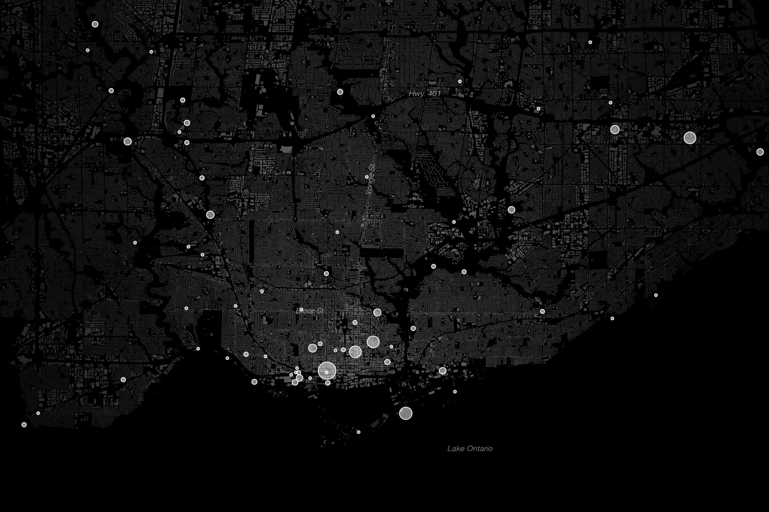
In Toronto’s Bridle Path, Bayview Village, and Willowdale neighbourhoods, the average resident can expect to live past 84 years of age—higher than even Japan’s world-leading life expectancy. Meanwhile, in less affluent parts of the city, such as Rexdale, Oakridge, and Moss Park, death comes more than a decade earlier—on par with countries like Tunisia and Nicaragua.
Those stark numbers, published here for the first time, are the results of a monthslong collaboration between The Local and researchers at MAP Centre for Urban Health Solutions at St. Michael’s Hospital. The project uses the latest available data from the 2021 census and 2020 and 2021 provincial death records to examine life expectancy at birth in all 158 neighbourhoods of Toronto—that is, how long a child born in a particular corner of the city would live if current patterns of mortality remain unchanged.
The findings fill in a crucial gap in our understanding of inequality in Toronto because few measures can give a sharper picture of disparity than differences in people’s lifespan.
The map of Toronto’s life expectancy has the familiar U-shaped pattern we reported in The Local’s first issue in 2019 and that played out in real-time during the height of the COVID pandemic—an affluent and healthy corridor up Yonge Street, flanked by less fortunate neighbourhoods encompassing the inner city and much of the inner-suburbs. It reveals socio-spatial divisions typical of big American cities like Chicago, Philadelphia, and New York, where wealth and health are inseparable, and where neighbourhoods just a few subway stops from one another can be worlds apart in terms of how residents experience life, and death.
“Wealth brings privileges, and one of them is longer life,” says Dr. Stephen Hwang, a physician and researcher on homelessness, housing, and health at St. Michael’s Hospital (Hwang is also the director of MAP, but was not directly involved in the life expectancy project). “We see these kinds of disparities in societies where we’ve structured the political and economic system in a way that creates winner-takes-all kinds of situations where if you win, you win big…and if you lose, you lose big, and you’re condemned to a life of deprivation, and so are your children.”
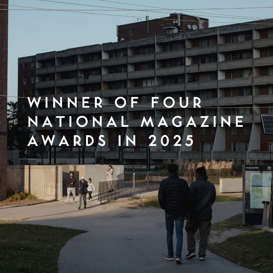
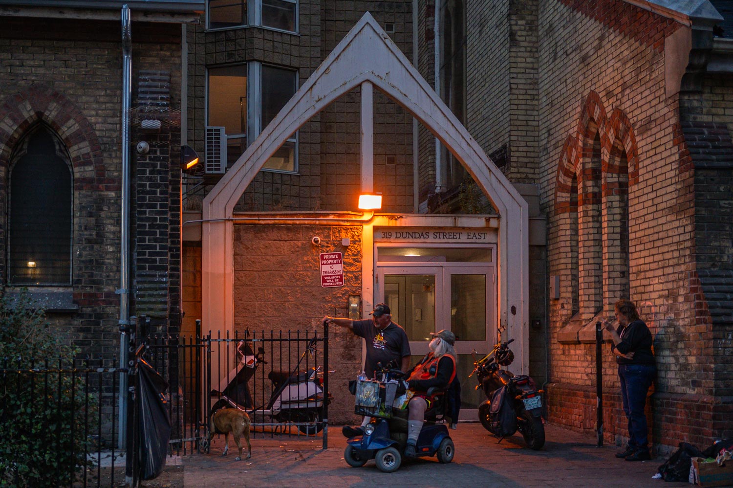
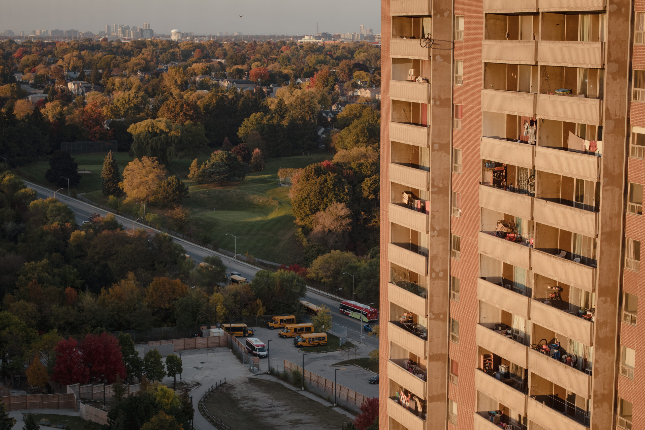
Nowhere is this more apparent than in Moss Park, where an infant born today can expect to live just 74.8 years (71.8 for males)—well below the citywide average of 80.9 years and nearly a dozen years lower than the top neighbourhoods. As The Local’s executive editor Nicholas Hune-Brown writes in his deepdive into the Moss Park numbers, in addition to the historical poverty in that neighbourhood, in recent years, Moss Park has suffered through the twin epidemics of COVID, with its attendant lockdowns and displacements, and the toxic drug crisis, both of which have devastated the community.
Dive Deeper into Moss Park
Grief, and hope, in the downtown eastside neighbourhood with the lowest life-expectancy in the city.
Wealth is one of the biggest drivers of health, and much of the life expectancy data follows a familiar pattern; people in richer neighbourhoods live longer and those in poorer neighbourhoods die earlier. But the data also contains some unexpected results.
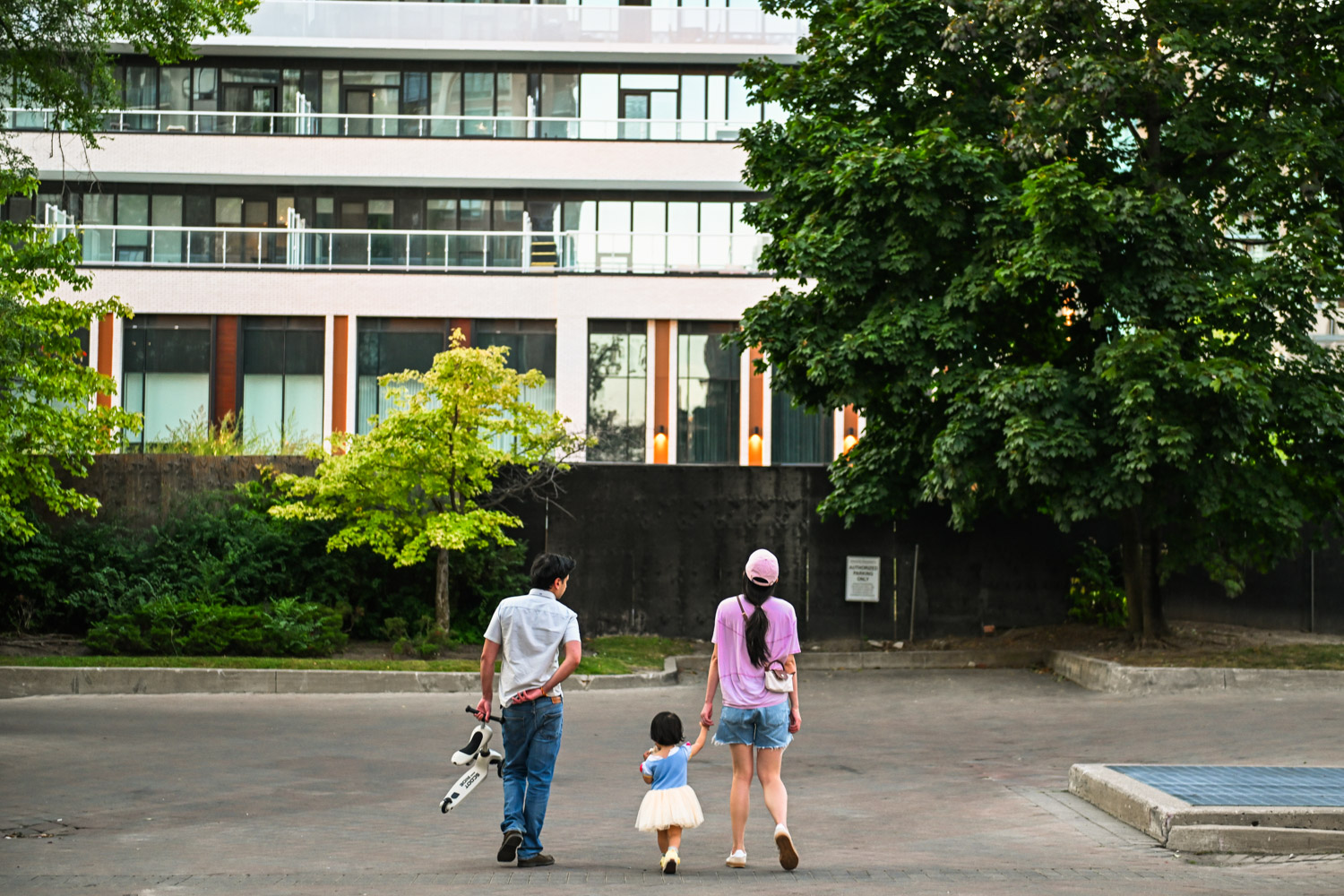
Yonge-Doris, an average-income neighbourhood in North York, has the city’s top life expectancy at 86.2 years. The narrow but high-density strip of condos around Mel Lastman Square is well-served by public transit and packed with walkable amenities and a seemingly endless variety of food options—the kinds of health-promoting features you’d expect to see. But, as reporter Rebecca Gao writes in her in-depth look at what’s behind Yonge-Doris’ success, what may set the neighbourhood apart is a less obvious marker of health: immigrants. In Yonge-Doris, 64 percent of residents are immigrants (compared to Toronto’s 47 percent) and most of them are economic immigrants.
Yonge-Doris’ impressive life expectancy numbers maybe due to a phenomenon researchers call the “healthy immigrant effect” whereby the immigration system itself selects for newcomers with higher social-economic status who end up propping up life expectancy in their new home.
Learn More about Yonge-Doris
Learn why this two-kilometre stretch of Yonge Street has the highest life expectancy in Toronto.
Zooming out, what we have is a map of Toronto that isn’t static as much as it is a snapshot of the ebbs and flows of people living out their economic realities. In a city increasingly characterized by crushing rents and soaring costs of living, those realities have sorted Toronto’s inhabitants into neighbourhoods with different lifespans based, sadly, on what they can afford.
In a perfectly equal society, neighbourhood disparities of this kind wouldn’t exist. But for Hwang, that is neither a practical nor realistic expectation. “I don’t think that the goal here is to equalize income or wealth. But I think we can all agree that we don’t want a society in which your opportunity and your horizons are determined by where you were born,” he says. “The fact that we have specific neighbourhoods that we can concentrate on provides, I think, a way forward.”
Prior to publication, we shared the life expectancy numbers and methodology with Laura Rosella, a professor of epidemiology in the Dalla Lana School of Public Health at the University of Toronto who studies premature mortality. The findings, she says, mirror those in her own work. “Myself and others have been looking at these kinds of patterns in different ways for over a decade, and we see a very similar trend,” says Rosella.
Like Hwang, Rosella has a practical mindset when it comes to solutions. “These deaths potentially could have been avoided if someone had prevention earlier, if they lived in a neighbourhood that was more conducive to healthy life, if there were social safety nets in place,” she says.
An important first step, they both say, is to get these numbers out there and ensure that governments are paying attention and accountable.
New York City is a good example of a local government leading the charge on life expectancy. In November 2023, city officials announced a goal to “create a healthier city for all” and raise New York City’s life expectancy to at least 83 years by 2030. It launched the HealthyNYC initiative, which is overseen by New York City’s Health Commissioner Ashwin Vasan. “When we’re talking about things like transportation, or education or housing or violence, we’re really talking about health,” Vasan said at the announcement.
The plan involves tackling several key drivers officials believe are responsible for New York City’s stalling life expectancy: chronic and diet-related diseases, drug overdoses, suicides, COVID, homicides, and maternal mortality—especially among Black women, who are four times more likely than white women to die from causes associated with pregnancy. Officials pledge to enact local laws, launch public campaigns to empower New Yorkers to live healthier lives, and hold local government accountable through a data dashboard that tracks the city’s progress over time.
Join our free newsletter
Sign-up to our free newsletter and get our new stories delivered directly to your inbox.
"*" indicates required fields
Compared to New York City, which began measuring neighbourhood-level life expectancy nearly a decade ago, Toronto is at the very beginning stage of the journey. And going from measuring something to doing something about it is no small leap.
“Obviously this is a public health kind of issue,” says Hwang. “I know that Toronto Public Health has always championed an approach of addressing priority neighbourhoods. It would be great for them to carry this forward, so that it’s not just a one-time thing, but something that gets built into our public health strategy.”
The Local reached out to Toronto Public Health on several occasions to request an interview with Dr. Eileen de Villa, Toronto’s medical officer of health. Those requests were declined.
Ultimately though, life expectancy is a simple measure with complex underpinnings. It is a metric of public health, but it might as well be a barometer of society itself. The great levellers, such as public education, health care, and social assistance, play a role and they are provincial responsibilities. Additionally, there’s the federal role in the economy, and the role of civil society, from churches to non-profits to unions, in trying to fill in the gaps in their communities. In a city of neighbourhoods, where even death is a differentiating factor, these mechanisms exist, and the current patterns of mortality can change.
“I think the first step would be to have this information spur us to actually want to make change,” says Hwang. “So rather than either turning a blind eye to the problem or pretending it doesn’t exist, we need to really face it head on.”
More from this issue
In the Annex and Crescent Town, Two Sides to Toronto’s Density Dilemma
The Annex had fewer residents in 2021 than 1971. The towers of Crescent Town had far more. How the uneven, illogical densification pattern of the last 50 years created today’s Toronto.
The Geography of Complaint
From wealthy neighbours griping about shrubbery to low-income tenants requesting winter heat—a map of 311 requests charts a certain kind of civic engagement, and privilege.
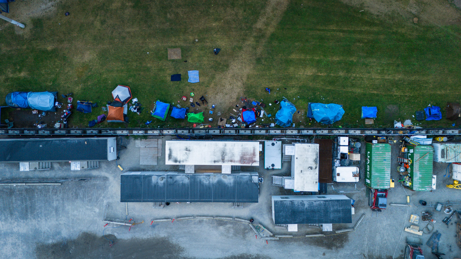
Toronto’s Encampments, By the Numbers
Recent analysis by The Local shows just how widespread encampments have become, and how the City’s clearing efforts simply pushed unhoused Torontonians from one park to another.
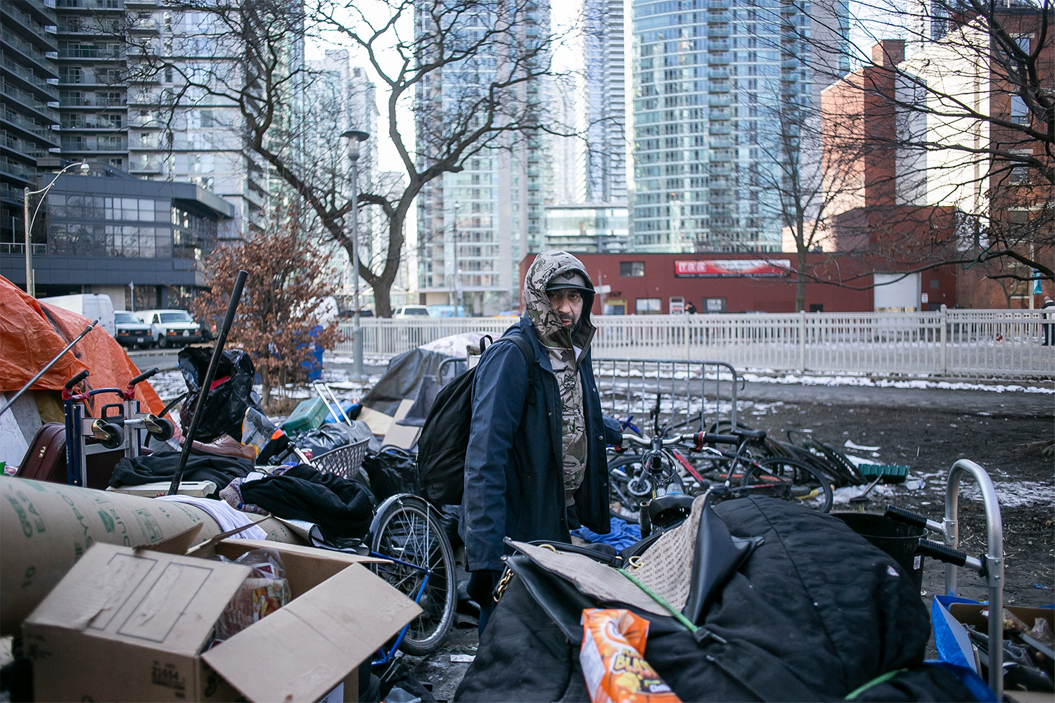
Another Year, Another Encampment, Another Eviction
For years, unhoused people like Davit Sesisheili have gone from park to park, moving when the City evicts them. With new data, and reporting and photography that spans years, this is the most comprehensive, intimate portrait of Toronto’s failing encampments strategy.
Moss Park’s Lost Years
Grief, and hope, in the downtown eastside neighbourhood with the lowest life-expectancy in the city.
Why a Two-Kilometre Strip of Yonge Street Has the Highest Life Expectancy in Toronto
This North York neighbourhood has plenty of public amenities and walkable streets. But the secret to residents’ good health may have a less expected explanation: immigration.