Toronto’s Geography of Difference
A gleaming condo tower rises above a desperate street. A tent city for the homeless beneath a concrete overpass is cleared out to become the setting for a lavish dining experience.
Toronto is a city of messy contradictions. The same ingredients that make up our diversity are also behind our divisions. But unlike the bustling streets, multicultural restaurants, and other signs of our celebrated diversity, the divisions that can have life or death implications for Toronto’s residents aren’t always readily apparent at street level.
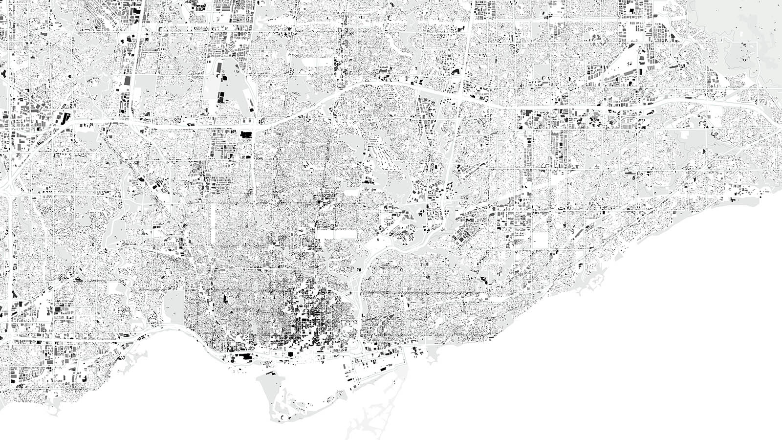
Maps can reveal truths otherwise invisible to the naked eye. In 2010, a series of cartographs by David Hulchanski of the University of Toronto told the story of a city that was becoming increasingly polarized. It depicted a Toronto made up of three cities: an affluent core along the Yonge Street corridor, a sprawling hinterland of low-income suburbs, and a rapidly shrinking collection of middle-income neighbourhoods sandwiched in between. Not surprisingly, the data also showed that low-income neighbourhoods are increasingly dominated by visible minorities, while high-income areas have remained relatively white over the years.
It’s the kind of sorting of urban society typical of big American cities, where growing income inequality has become the source of distrust, urban blight, and a range of social ills. In Philadelphia, babies born in neighbourhoods only several kilometres apart have a 20-year difference in life expectancy. Unequal societies like the United States tend to fair worse on a range of population health outcomes compared to more equal ones like Sweden, Finland, and Norway. Is this the kind of dangerous path Toronto is on? Are we already there?
A bird’s-eye view of Toronto in 2019 reveals a city where geography is destiny and a person’s postal code can be as telling as their medical chart. It’s not just income that pools in specific areas of the city. Chronic diseases like diabetes are rampant in the inner suburbs—an affliction to which those living in the affluent neighbourhoods along the Yonge Street corridor appear to be nearly immune.
The city’s divisions don’t always follow the urban-suburban fault lines. Even within the downtown core, we see stark differences. A resident of Moss Park is four times more likely to die prematurely (before the age of 75) than the average Torontonian and six times more likely to die early than someone just a few blocks away in the adjacent Waterfront neighbourhood.
The fact that those living in our wealthiest neighbourhoods enjoy better health isn’t surprising. The relationship between wealth and health has long been established. The only real solution, the argument goes, is to reduce income inequality through things like better economic opportunities, more progressive taxation, and a higher basic income.
But what a ten-thousand-foot-view of the city reveals is a pattern of urban and health planning that has deepened the disparities between rich and poor neighbourhoods. Take diabetes. It’s not just that the poorest neighbourhoods have the highest rates of diabetes, it’s that they’re also the least walkable. Research shows that residents of these neighbourhoods are more likely to be car-dependent, less likely to use active transportation like walking and biking and, as might be expected, are more likely to develop obesity and diabetes.
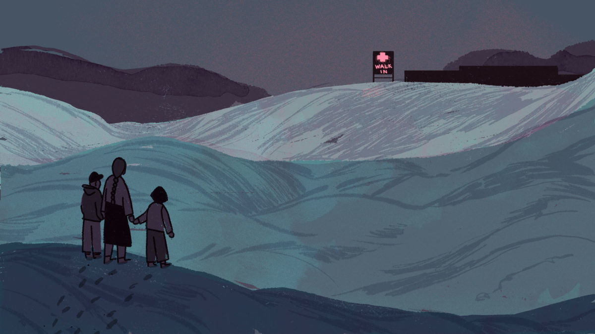
And while managing a chronic disease like diabetes demands constant access to primary care, the neighbourhoods with the highest rates are also those where options for medical treatment are scarcest. These “health care deserts” are neighbourhoods with high health care needs, but few doctors providing comprehensive primary care. Conversely, the wealthiest and healthiest neighbourhoods enjoy a disproportionate share of good primary care.
It’s common to think that people choose their neighbourhoods, but to quote Hulchanski, “it’s money that buys choice.” Those with means will always be able to outbid those with lesser means for desired locations. While correcting growing income inequality is a legitimate goal, what these maps depict is a city shaped not just by market forces, but also misguided planning and the politics of indifference. More than mere geography, the maps urge us to ask a fundamental question: whose interests does a booming city serve?
_________
About the maps: Data sources include Statistics Canada (income), Ontario Community Health Profiles Partnership (walk score, family health team patients, diabetes, premature mortality), and the City of Toronto (neighbourhoods, building footprints). Full methodology here.


