

Sometimes the little ironies of your life catch up with you long after the fact. Like, for example, the fact this story starts on April Fools’ Day in what will only be (alas) the first year of the COVID-19 pandemic.
At that point I had been working at home for… a week? Two weeks? I work for TVO, Ontario’s provincial public broadcaster (Never Stop Learning™), and our response to the declared state of emergency was to push as much information out to the public as possible in some kind of coherent, accessible way. I was recording daily podcasts in my linen closet and trying to stay on top of multiple daily news conferences from home. It was, in a word, bananas.
So I was either alone in my home office or, perhaps, begging my daughter to brush her teeth and put on some clothes, when the province reported the number of people hospitalized with COVID-19 that day, as well as the number of people in ICUs and on ventilators. It wasn’t the first time Ontario had reported those numbers, but something twigged in my brain that day: I was going to be keeping track of these numbers for a long time, so I should probably figure out some way to organize them.
I opened up Microsoft Excel, dropped the day’s numbers in there, and went on about my day. I had no idea what was coming over the rest of the pandemic —the horrifying death toll in long-term care homes; the summer lull; a second wave deadlier than the first —none of that was in my imagination at that moment.
On April 1, 2020, there were 401 new cases of COVID-19 and a total of 53 people in Ontario had died.
Ten days later, I figured I had enough numbers to do something with them. So, using my absurdly rudimentary Excel skills, I whipped up a quick chart and posted it to Twitter. Nine minutes later, I got a message from my editor. “How did I not know that you make SPREADSHEETS with COVID-19 DATA,” she asked.
And that was it: something that I’d started as a lark was now a commitment for work. Every morning, seven days a week, when the province’s data was published I’d quickly shoot the numbers and fresh charts to my editor for publication on TVO’s website before tweeting them out myself.
For about a year now, I haven’t stopped. With only a handful of exceptions, I’ve looked at the province’s numbers every day, sharing it in Twitter threads that have grown increasingly ornate as the data released by the province has expanded. Whether my kid was home or (eventually) at school, whether I was sick with (only) a cold or healthy, through the heat of summer and eventually the dreary rain of the fall and the grey of a Toronto winter I’ve spent the year building my day around that moment in the middle of the morning when Ontario publishes it’s COVID-19 statistics for the day.
On April 10, 2020, a total of 253 people in Ontario had died of COVID-19 and 411 new cases were reported. If nothing else in my life was even remotely under my own control, at least I had made myself a system.
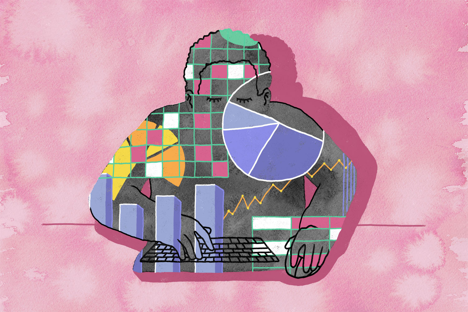
Journalists are notoriously bad at math. Some reporters wear it as a kind of perverse badge of dishonour—“if I could do math, I wouldn’t have become a reporter”—but math is also an unavoidable part of the job. Even political reporters need to know when they’re being spun by a government, a corporation, or anyone else with the means to spin them.
But in recent years, what journalism has asked of math has changed. With the rise of stats nerds like Nate Silver and data journalism more broadly, we now ask the numbers to do something more difficult and more important: tell us the truth and, if at all possible, tell us the future.
At first, posting the day’s COVID numbers was straightforward: I was focused primarily on hospital admissions and the raw case count every morning. Each day last spring, I would wait for the province’s public-facing webpages to update at 10:30 a.m., punch in three or four numbers, and quickly post the charts to TVO and Twitter.
By the summer, it was slightly more sophisticated. Before the province formally publishes its new data at 10:30 a.m., it updates the datasets those releases are based on, and those datasets are all available through Ontario’s open data catalogue.
Each morning, after begging my wife’s patience yet again to watch our daughter while I “do the numbers,” I would load up the province’s datasets and keep hitting the refresh button until the new data appeared. (I’m nearly certain there’s a smarter way to do this, nevertheless I must beg of you: don’t write me, this works for me.) As I fill a new row with new numbers, a bunch of pre-written formulas and pre-formatted charts do most of the work.
Because I’ve chosen to keep pushing COVID data out over Twitter, humanity’s worst invention since 2006 and counting, I have had the pleasure and displeasure of interacting with all kinds of people. The most irritating, though not the most common, are the monsters. I have been called every possible synonym for fascist and government lapdog for buying into this PLANDEMIC and HIDING THE TRUTH. It started in April and it has not let up.
More numerous are those who are simply angry that, a year into this thing, they’re still living in fear of something the government doesn’t seem to have under control; I get a lot of retweets from people who tag in Premier Doug Ford or minister of health Christine Elliott to yell at them.
But even more common are the people who just want to know what’s happening next. The numbers are up today, will they be up again tomorrow? When will the lockdown end? When can my kid go back to school? When, for the love of God, will we be safe again? It might be the oldest human impulse, at least since we invented narrative: people want someone to tell us what comes next.
The problem is that the answer to all of these questions is: I don’t know. The good thing about Ontario’s real and praiseworthy commitment to getting all of this data out and in the daylight is that literally anyone can access it. The unsatisfying corollary to this is that I don’t know anything you don’t. Or rather, the stuff I know that you might not isn’t really related to the COVID data. I might have an insight into when a lockdown can end because I’ve read the province’s relevant legislation, or I might have heard something in a press conference you didn’t.
About the only rule I’ve given myself is not to say anything about trends unless I’m looking at three or more days of data. Whatever you think you’re seeing, wait one day, and then wait another and see if it bears out in the data. That’s frustrating to some people because I’ll stay ambiguous, or silent, instead of just answering their questions. I get it! But trust me: wait one day, and then wait one more. It’ll be better for your mental health, or at least it has been for mine.
On May 23, 2020, a total of 2,073 people in Ontario had died of COVID-19.
I’ll be the first to admit it’s odd to be so emotionally invested in a spreadsheet. But when I allow myself to remember what’s behind all those numbers, it almost seems stranger not to just live my days in constant grieving.
Like any other vital sign—a heartbeat, a breath—the data has predictable rhythms. It’s not the perfect oscillation of a machine, but a messier, more organic cycle depending on everything from the day of the week to the vagaries of provincial bureaucracy.
Most days the long-term care data is posted first, then the regional breakdowns. On weekends, testing numbers drop reliably, as do the counts of people hospitalized. On any day, we could get an advisory from the ministry that there’s a hiccup somewhere and today’s number could be an under- or over-count.
I’ve spent weeks and months looking at the same data every morning, and whatever the specific numbers are for that day, I find these rhythms reassuring. They tell me nobody is cooking the numbers: I’m not sure they could if they wanted to. The mess is also a signal. It says there is, somewhere at the far end of the internet from me, an actual human being pushing buttons to publish the data, just as I’m sitting at a computer on my end pushing buttons waiting to see it.
That person works for the Ontario Digital Service, and they’re collecting data from the ministries of health, long-term care, and (since September) education. Even that doesn’t tell the whole story: the ministry of health’s data is collected from public health units across the province, who are themselves collecting data from sometimes vast regions: the Thunder Bay public health unit starts at the north shore of Lake Superior and extends all the way to the shore of Hudson’s Bay.
Somewhere at ODS, someone is building new datasets that power new websites to push new developments to the outside world. They’re receiving data from all over the province–some still via fax machine–cleaning it up and making it presentable to the outside world.
Some mornings, as my mind wanders waiting for the numbers to be published, I think about the person on the other end of the internet. Telegraph operators used to be able to identify their counterparts based on the “fist” of the operators, their name for the unique human rhythm of precisely how the dots and dashes were spaced out as human hands tapped out a message. If I knew their names, I think, could I tell who was working the COVID shift at ODS that morning by when the datasets were updated, and in what order? Could I tell that Jack’s kids had gotten out of hand that morning, or that Jane had to hassle someone at a ministry for corrected data?
After all, underneath all the data, all the numbers, all the spreadsheets, it’s all just people working, living, and dying.
By late June, three months into the pandemic, my editors at TVO made the decision to stop doing the daily updates. The team was exhausted, and in the summer lull it was decided it wasn’t so urgent to do daily news updates anymore.
In theory, I could have stopped tweeting as well. In practice, stopping never occurred to me. I couldn’t give you a clear reason why, except to say that I’ve continued for the same reasons that I work at TVO: I’m a journalist and I try to be a decent public servant and if I’m never going to be the kind of reporter who makes my name with a Watergate-style bombshell, I can at least be useful. And this was how I could be useful to people trying to get through a pandemic.
The first week of July, I took my first break, spending time with my wife and kid in a part of the province with sandy beaches. The vacation was needed and lovely. But there I was, at a cottage dining room table with a cold beer, checking the data. After living with these numbers in my head for three months, how could I not look?
On the day I came back from vacation, for the first time since the pandemic had begun in earnest, Ontario reported no new deaths.
The province’s case numbers spent the summer dropping to new lows. Canada Day? 153 cases. 102 cases on July 14. Finally, on July 29, hitting the refresh button at my desk spat out something we hadn’t seen since before the pandemic exploded in March: fewer than 100 new cases reported.
I resolved to stick to my rule: get a hold of yourself McGrath, it could be a blip. Be patient, don’t get too excited. Wait for three days.
I failed. The next day, after so many months of sickness and death, Ontario posted a second day of fewer than 100 new cases (89, this time) and a relatively merciful four deaths between the two days. This time, I started crying at my desk.
This has been hard, all of it, from the stress and boredom of isolation to mourning the dead. All of it has been hard. This wasn’t a data error, and it wasn’t just a blip. It was really happening. 15 of the 31 days in August would see fewer than 100 new cases of COVID-19 in Ontario.
By the end of that month, I started to wonder if posting the daily numbers was still worth the effort. I put the question out there: were the daily tweets still useful to people? Twitter answered emphatically in the affirmative, and I haven’t asked again since.
That day was August 29, and there were 112 new cases of COVID and only one new death (bringing the total to 2810.) I was swimming at the city pool most mornings. My daughter was set to return to in-person school in September. We were rebuilding a little bit of normalcy. For a few days in August I think I briefly let myself believe that we might have found a cheat code that would let us get back to our lives.
I was, of course, wrong. By the time I’d posed that question to my followers on Twitter, the pandemic was already coming back to Ontario in a second wave that would dwarf the first.
I started all this by tweeting out numbers. But I don’t think people really want the numbers. They want someone to tell them where they are in the story, and how the story is going to end.
By the end of September, Ontario was seeing numbers of new cases that we hadn’t seen since April—400, 500, 600 and more. Through October, the province regularly posted new records. Deaths followed like the reliably lagging indicator they have been throughout. The morning routine of calling up the data at my desk, which had so recently been cause for relief, started to take on a sense of dread.
As the fall turned to winter, dread turned into equal parts frustration and anger. Watching the case counts climb knowing that it would again become impossible to protect people in long-term care, watching it all play out again like some terrible re-run, except this time with the knowledge of the first wave to guide us, has been infuriating. By December it started to look dubious that schools would return in January (spoiler: they did not.) I was losing control of my life again, normalcy was evaporating on me, so I did what anyone would do over their Christmas vacation: I rebuilt my Excel file from the ground up to make the work of getting the tweets out every morning easier and cleaner.
I’ll be the first to admit it’s odd to be so emotionally invested in a spreadsheet. But when I allow myself to remember what’s behind all those numbers—thousands of people dead, hundreds of thousands made sick in this province alone— it almost seems stranger not to just live my days in constant grieving. Underneath all that data, it’s still all people. Their lives and their deaths. The people labouring to test them, to heal them, and, by early 2021, to vaccinate them. If you know how to read it, it’s as much a narrative of the pandemic as any longform article in The New Yorker or The Atlantic. The difference is that my five-year-old is some years away from reading prestige magazines, but she understands what the curved line on one of my charts means—when the line bends down far enough, she can hug her cousins and her grandparents again.
Data on its own is mute. It can’t say anything by itself. It’s only after we organize it, manipulate it, categorize it, that we can start to do something with it. We imagine we live in a 21st century world dominated by the power of data, big data, fast data, but we still find meaning in the symbols that abstract away that data, that hide it from view, and tell us a story instead.
I started all this by tweeting out numbers. But I don’t think people really want the numbers. Nobody really wants to know that more than 7,000 people in Ontario are now dead or that we’ve had more than 300,000 cases. They want someone to tell them where they are in the story, and how the story is going to end. The catch is: I still don’t know anything you don’t know, except that all the columns in my spreadsheet currently go until December 31, 2021.
I may not know when, but this will end. We will get our lives and liberties back, we will huddle at crowded tables in bars, split a plate of nachos. We will run out to corner stores without having to make a risk-benefit analysis in our minds. My parents will get to hold their grandchild again. This will end. What I fervently hope for is a day when I can tell people that there are no new cases of COVID-19 in Ontario, with no hospitalizations and no new deaths, as tens of millions of people are vaccinated across Canada. Maybe I’ll get to put that in a tweet some day. But after I do, I’m going to wait a day. And then I’m going to wait one more.
More from this issue
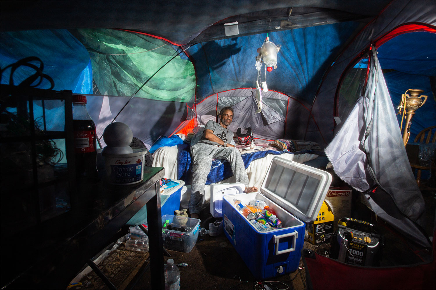
A Year of Resistance in the Moss Park Encampment
Derrick Black, one of the original residents of the Moss Park encampment, survived a year of confrontations with the city, police raids, and extreme weather in his fight for permanent housing. His story in his own words.
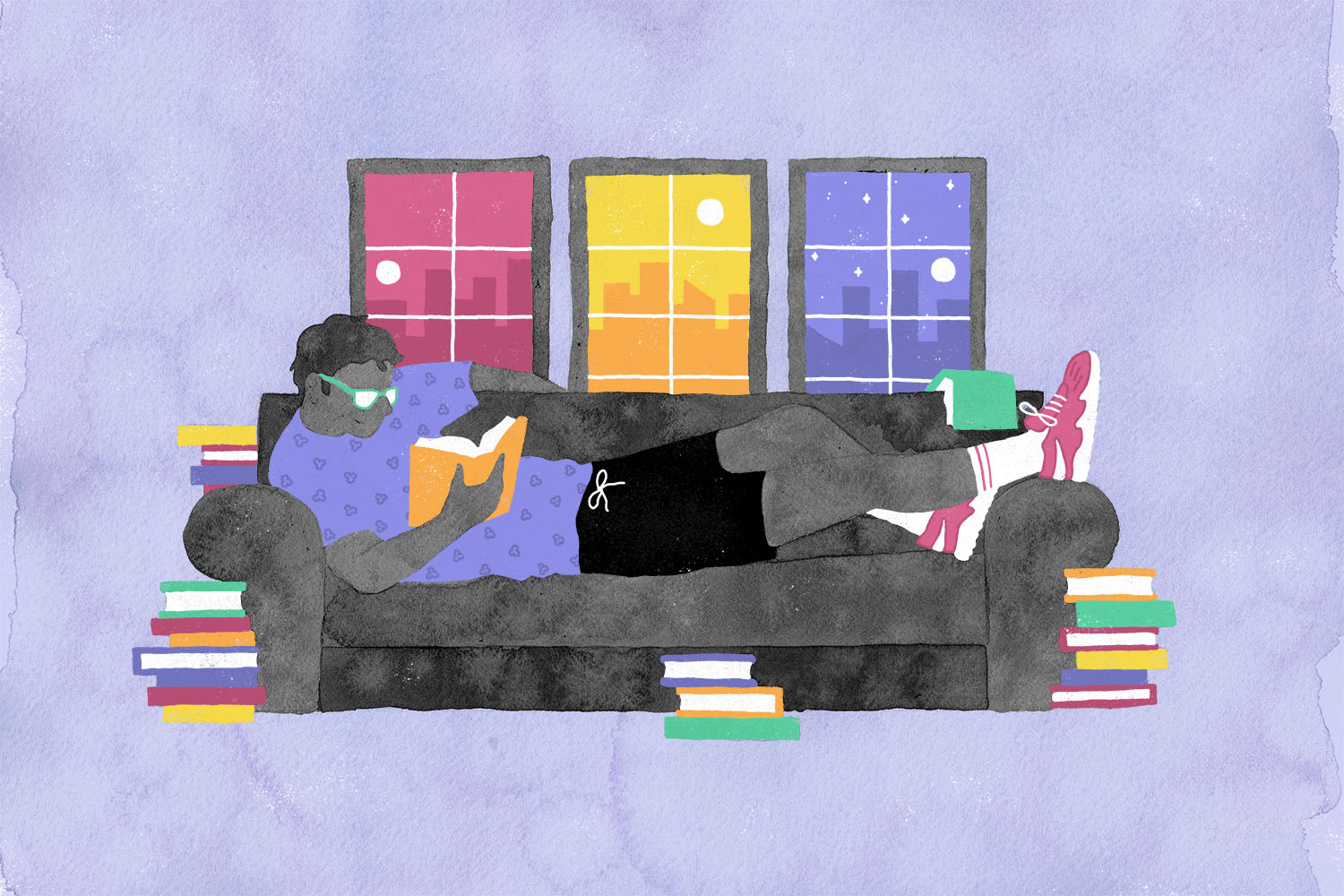
A Long Year
As the months stretched on and days became meaningless, I did the natural thing—turned to 800-page novels and 15-hour German movies just to feel the passage of time in all its punishing slowness.
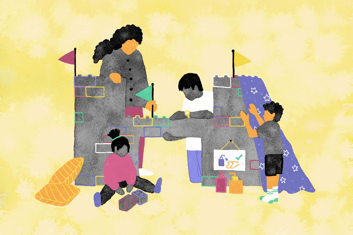
A Year of Kids Playing Pandemic
When COVID-19 leaked into my children’s make-believe games, I worried they were being traumatized. Maybe I’ve been looking at it the wrong way.
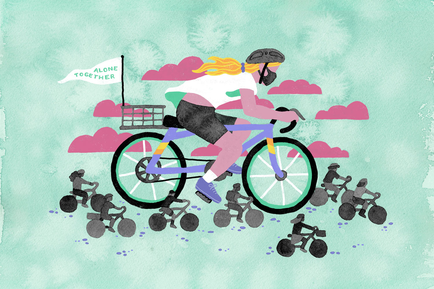
A Year on Two Wheels
My father believed that biking was a way to strengthen our communities. In this strange and sorrow-filled year, I’ve tried to follow his path.
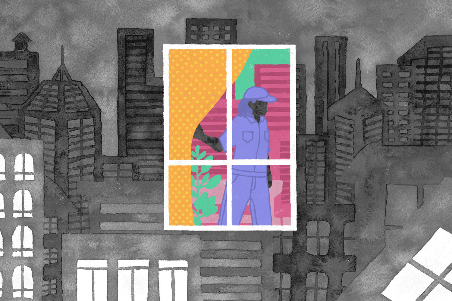
A Year in Toronto
In a year of “unprecedented times,” the world didn’t split apart in ways that were terrifying and new. It cracked along familiar seams, over and over again.
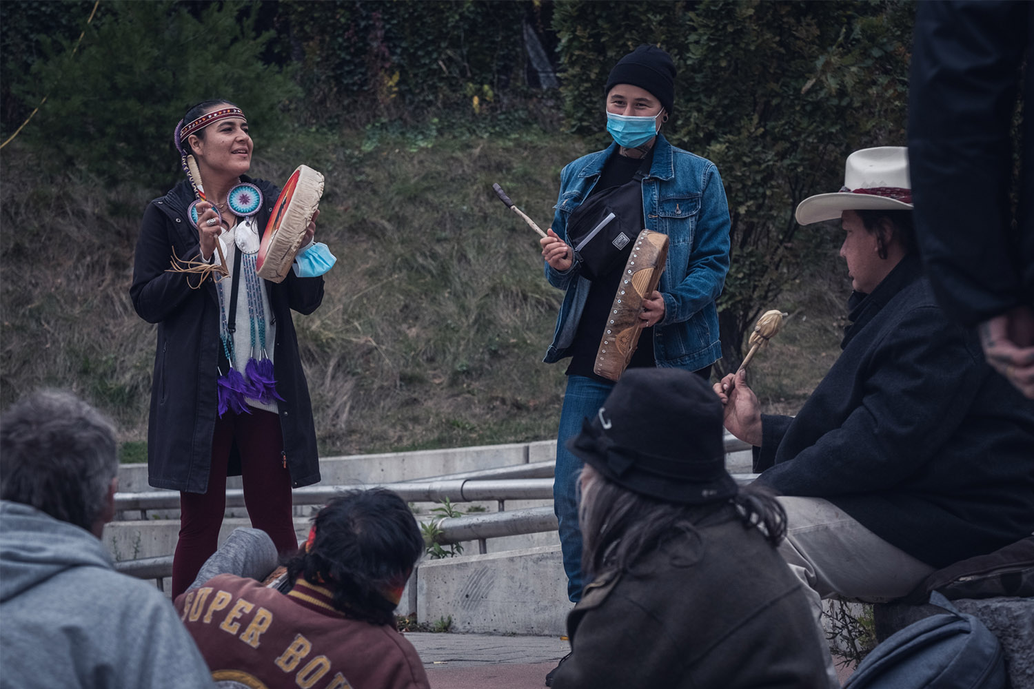
A Year of Indigenous People Helping Indigenous People
In the middle of a pandemic, with multiple crises devastating their community, Nanook Gordon and Brianna Olson Pitawanakwat started a grassroots organization to bring compassion, aid, and culture to Indigenous people on Toronto’s streets.