Vaccine hot spots aren’t static. If the intention is to vaccinate the highest risk neighbourhoods first, then there is a need for more real-time, dynamic prioritization.
As new data are released by ICES each week, I will be updating this blog to help track these moving targets. Which neighbourhoods are falling behind? Where do we need to focus our efforts? We can’t know unless we look at the data.
June 27 Update
School’s out. While it’s hard to think about September after the year we’ve had, what happens over the next 10 weeks will determine the kind of back-to-school we’ll have in the fall. Since a vaccine for use in kids under 12 is unlikely to be approved earlier than late 2021, vaccine coverage in the surrounding community will be an important factor for safe in-class learning, especially in elementary schools.
Unfortunately, the percentage of the population with at least one dose has slowed even further compared to last week. There are several pockets in Toronto’s northwest where first dose coverage is stuck in the mid-50 percent: M3N (Jane-Finch), M9V (Rexdale), M9N (Jane-Lawrence), and M6M (Keele-Eglinton). They are this week’s postal codes of concern. M3N, for example, is 56 percent vaccinated for at least one dose, and growing at around one percent per week. If this were to continue over the next 10 weeks, the Jane and Finch community would be at around 66 percent by the start of school, far below the 90 percent that some experts are saying we’ll need to get to when the Delta variant takes over. Obviously, there’s a lot of work to do over the summer months in these under-vaccinated pockets of the city.
Last week, M4H (Thorncliffe Park) was the mover of the week, with a whopping 19.7 percent gain in second dose vaccination. They ranked first among all 102 postal codes in Toronto. This week? They’re at the bottom, 102 of 102, with a weekly gain of just 5.6 percent. I’ve spoken with several vaccine people in the area and many seemed surprised by this precipitous drop. It’s unclear what factors might have contributed to this slow down. One possible factor might be finite vaccination resources shifting to other nearby neighbourhoods. During the week in question, the City of Toronto added two additional hot spots to its Sprint Strategy; M3C (Flemingdon Park) and M1L (Clairlea-Oakridge-Taylor Massey). All three postal codes are under Michael Garron Hospital’s responsibility and it’s possible that the dramatic slow down at M4H is a reflection of finite resources shifting to new areas. Regardless of the reason, one thing has been consistent throughout the vaccine rollout: hot spots need constant attention.
One recent development that will help maintain a constant local presence is the opening of a new “fixed” pop-up vaccine clinic at Albion Arena in Rexdale. To date, the site has been used sporadically. The more permanent site, operated by VHA Home HealthCare, promises to keep vaccines flowing into M9V and surrounding hot spots throughout the summer.
Second dose vaccination has picked up in Peel. However, rates are still significantly behind those in other Delta hot spots designated by the province for accelerated second doses. Within Peel, the disparity remains stark between high-risk and low-risk areas.
June 19 Update
After taking last week off to work with my colleague Nick Hune-Brown on an in-depth story about second doses, the Hot Spot Tracker is back in action this week. With second dose vaccination now in full swing, the Tracker will start monitoring progress on that front. However, with a significant portion of the population still without a first dose, the Tracker will also keep an eye on unvaccinated pockets of the city.
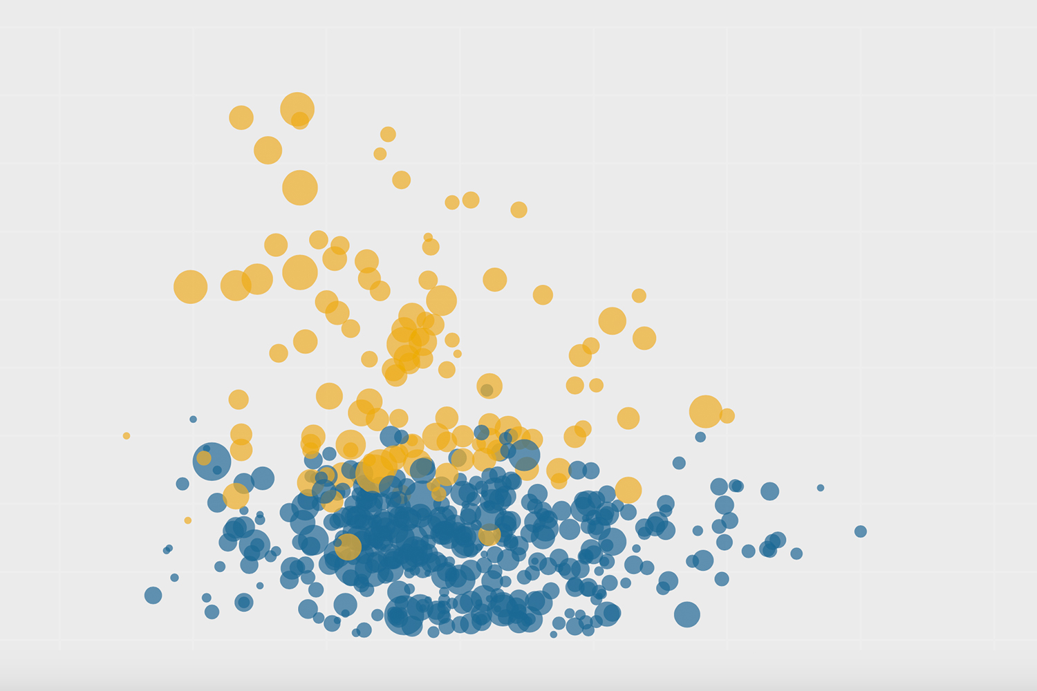
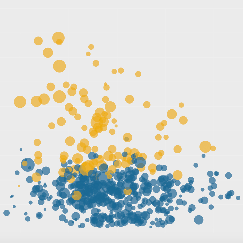
Overall, first dose vaccination has slowed to a trickle (see scatterplot, slide 1). Across Toronto, the week-over-week increase was only 2.3 percent, compared to well above 8 percent in early May. Importantly, high-risk areas continue to trail low-risk areas for first dose coverage by a significant margin. In the ideal public health scenario, the reverse would be true. But this is Toronto, where these contradictions are the norm. As Danielle Groen wrote about in her recent feature, “The Last 25 Percent,” we are entering the hard part of first dose vaccination, one that demands commitment, ingenuity and deep familiarity with the local terrain.
Turning to second doses, that’s where the main action appears to be right now. Across Toronto, the week-over-week increase in second dose coverage was 7.4 percent. In the scatterplot (slide 2), most postal codes can be seen moving from left to right with pace. Toronto Public Health has prioritized 20 hot spots for additional vaccine allocation (yellow dots in the scatterplot), and the strategy appears to be working. The week-over-week increase among the hot spots was 7.9 percent. There’s no telling how far back they’d be without the extra boost. However, in spite of these efforts, second doses are beginning to fall into the same pattern observed for first doses—they’re missing those who really need them.
Mover of the Week
M4H (Thorncliffe Park): The largest gain in second dose coverage goes to M4H, an ethnically diverse enclave on the east bank of the Don River just below Eglinton. Coverage rose from 5.0 percent to a whopping 19.7 percent, a weekly gain of 15.7 percent. In the scatterplot (slide 3), M4H streaks across the screen with velocity. In the maps below, the big hole in M4H from the previous week has filled in nicely.
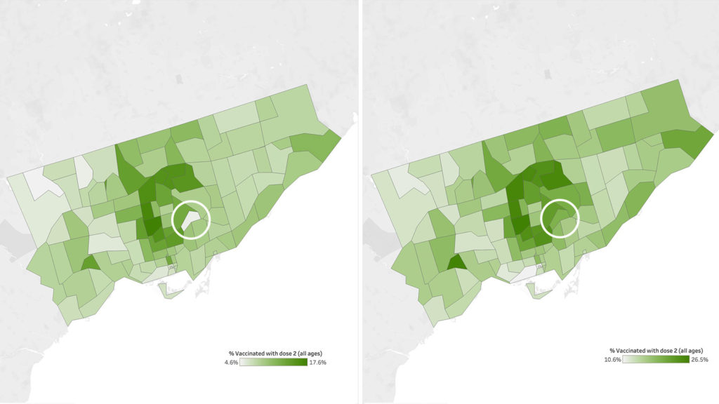
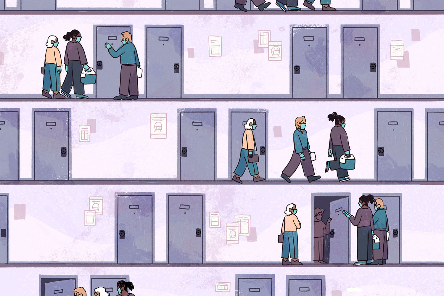
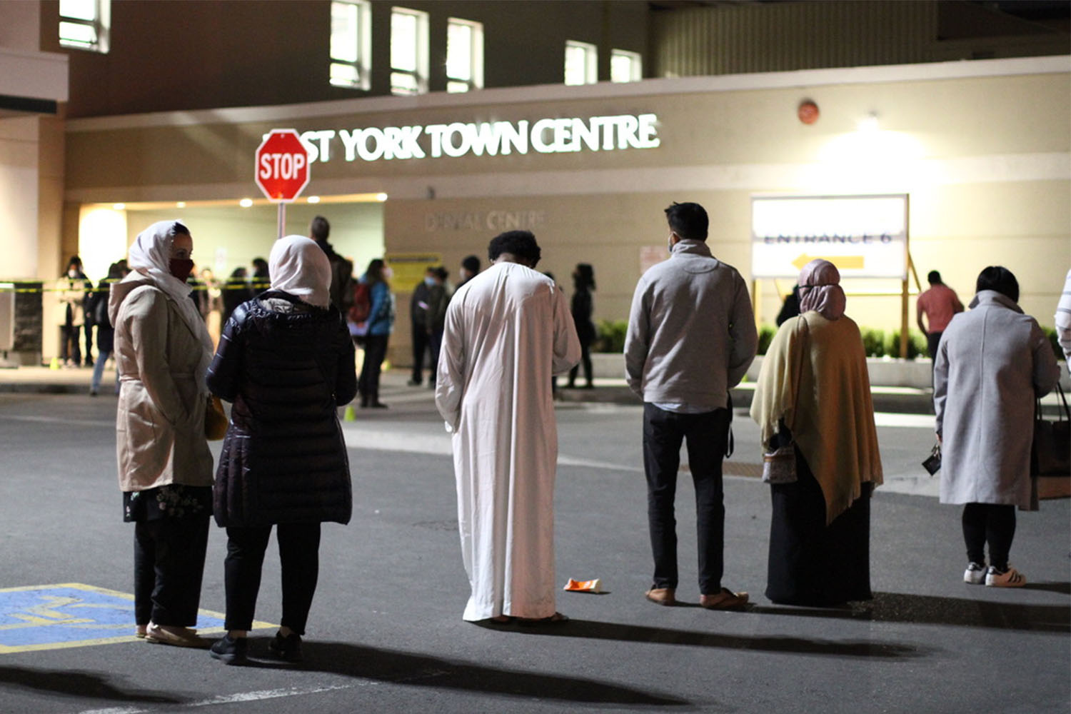
A big part of M4H’s second dose success has been the influx of additional vaccine supply. However, M4H isn’t unique in that regard—19 other postal codes were also allocated extra doses. The difference has to do with the tight collaboration among local organizations to ensure that the allocation stays in the area. This means lots of boots on the ground, going door to door, taking advantage of the numerous high-density apartment towers dotting Thorncliffe Park. Everyday, from 3:00pm to 9:00pm, a mobile team goes out to a different building, bringing vaccines to local residents. They include seniors, people in essential jobs, or parents who have a hard time finding child care—people for whom booked appointments or lining up at a pop-up clinic is difficult. The mobile team also connects with residents missed during the rollout of first doses, which increased nearly 3 percent last week, among the highest in Toronto.
M4H also benefits from having a vaccination clinic located at the neighbourhood mall, the East York Town Centre. There, the same principle applies—prioritize local residents. Within the scheduling system, slots are set aside for local agencies to use when booking clients who live in the area. With the heightened demand for vaccines during the early stages of the second dose rollout, these strategies help offset the natural tendency of residents from advantaged neighbourhoods to cannibalize resources from the rest of the city.
Postal Codes of Concern
M3N (Jane-Finch), M9N (Jane-Lawrence), M9V (Rexdale): These areas of Toronto’s northwest face the double whammy of low first and second dose coverage. All three are barely over 50 percent for first doses and just over 10 percent for second doses, in spite of being prioritized among the 20 Toronto hot spots for extra vaccine supply. Of course, the situation would be much worse if not for the extra allocation and tireless efforts of numerous local organizations, both of which will need to continue in order to keep these areas from falling further behind.
Peel
Peel continues to trail the rest of the province for second dose vaccination, despite being among the top regions for the Delta variant. In the scatterplot (slide 5, in red), a number of big postal codes in Brampton—L6P, L6R, L5T, L6V, L6X, L7A—have less than 10 percent of their population fully vaccinated. For comparison, all Toronto postal codes are above 10 percent fully vaccinated. The situation in Brampton is worth paying attention to because the Delta variant is on the cusp of becoming the dominant strain there, approaching 50 percent of new cases.
On June 7, GTHA mayors and chairs asked the province for additional vaccine shipments to their regions—basically a resumption of the hot-spot vaccine allocation the province halted in mid-May. That request was not granted. Instead, the province announced that residents of Peel (along with other Delta variant hot spots) would be eligible for accelerated second doses starting June 14. The effect of that policy is not reflected in this data, which accounts for the period up to June 13. We’ll know next week.
***
June 5 Update
Ontario’s accelerated dose two schedule, based on when people got their first shot, threatens to replicate the disparity of the initial vaccine rollout. That’s because in order to get to dose two, you first need to have dose one.
With Canada expected to receive more than 2 million vaccine doses per week throughout the summer, Ontario announced that it is accelerating the schedule for when people can receive their second doses. Starting Monday, June 7, individuals aged 70 and over as well as anyone who received their first dose of an mRNA vaccine (Pfizer or Moderna) on or before April 18 will be eligible to book an appointment for their second dose.
With the emergence of the more transmissible and potentially more virulent Delta variant (the virus formerly known as B.1.617), experts and public health officials believe that an accelerated dose two schedule is crucial. This is supported by new UK data showing that a single dose offers about 30 percent protection against Delta compared to about 90 percent for two doses.
It’s pretty clear from the data that many of the hardest-hit areas still have a significant proportion of their population unvaccinated. In M3N (Jane and Finch), over 50 percent of residents, more than 20,000 people, remain unvaccinated (kids below 12 aren’t able to get vaccinated of course). Viruses don’t have a brain, but they are clever; they go to where we’re most vulnerable. Places like M3N—with a large unvaccinated population, and many people in essential jobs—are likely to be where Delta will gain a foothold, just like Alpha (formerly known as B.1.1.7) first did.
By the way, if you’re interested in a deep dive into what’s happened with the hot-spot strategy, check out our collaborative project with the Toronto Star.
According to Dr. Peter Juni, scientific director of Ontario’s COVID-19 Science Advisory Table, the Delta variant now makes up about one-quarter of COVID cases in Peel. He believes that the province needs to flood these hot spots with vaccines, a strategy that the province halted about three weeks ago.
Even with the accelerated second dose strategy, many residents of hot spots are unlikely to benefit from the extra protection as things currently stand. April 18 is a crucial date because it timestamps who’s eligible to get dose two starting on June 7. The scatterplot below gives a snapshot of what vaccine coverage looked like across Toronto, Peel, and York region on April 19. It shows that a much lower proportion of residents will be eligible for second doses from high-risk areas compared to those in low-risk areas. In Rexdale (M9V) for example, only 17 percent are eligible for their second dose compared to 40 percent in The Kingsway (M8X), one of the lowest risk and most affluent areas of Toronto.
To contain the Delta variant across the province and give it the best chance to reopen, it’s quite obvious what the vaccination strategy needs to be. There needs to be a second version of hot-spot vaccine allocation, where a high proportion of doses are channeled to high-risk, highly-unvaccinated areas of Ontario. Moreover, to prevent the dose two rollout from mirroring the disparity of dose one, hot-spot areas will need a hyper-accelerated dosing schedule. This could mean simply following the product monograph of three weeks between doses for Pfizer and four weeks for Moderna for residents of hot spots.
Ontario’s accelerated second dose strategy, announced on Friday, is largely a per-capita strategy, fast-tracked. The strategy will be helpful in countering the rise of Delta, but it could yield greater benefit with a hot-spot component. Second doses in hot spots that are Delta-dominant will have a much greater impact than second doses in non-hotspots that are Alpha-dominant.
***
May 29 Update
We’re on the eve of the vaccine rollout transitioning to the second dose. And that’s a very good thing, especially for the many seniors across the city who’ve been awaiting a return trip to the clinic. It’s an important milestone—the midway point, if not scientifically then symbolically—for the largest vaccination campaign in history.
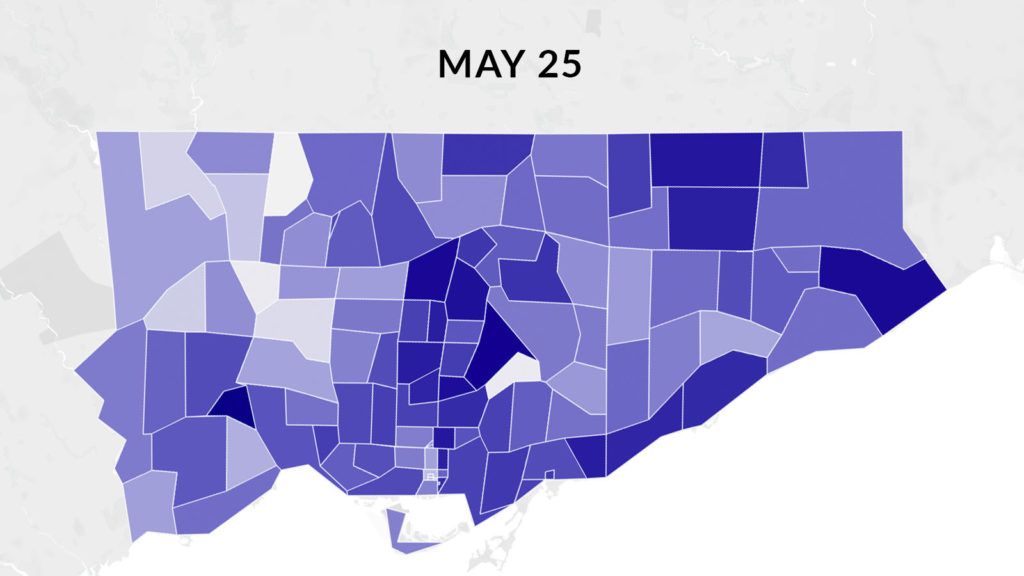
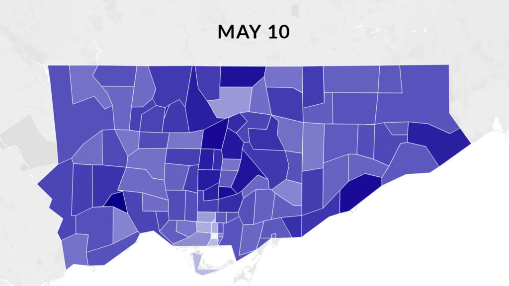
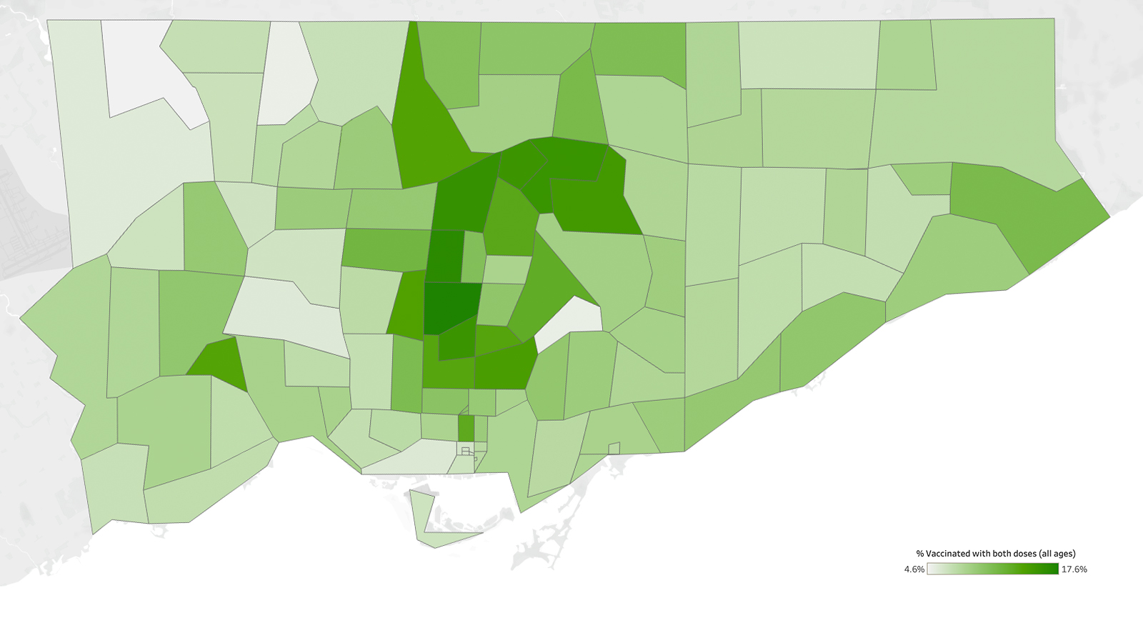
For this update, let’s take stock of where things stand across different neighbourhoods. The main takeway is that things aren’t as pretty as they were a mere two weeks ago during the height of the hot-spot strategy. As far as vaccine disparity is concerned, much of the gains made in hard-hit neighbourhoods have been erased. The closest Toronto got to parity was on May 10 (see map below). Since then, advantaged neighbourhoods have raced ahead, while areas like Jane and Finch and Thorncliffe Park (the two bright polygons on the May 25 map) have fallen significantly behind. In a number of postal codes, particularly in Toronto’s northwest, the majority of the population remains unvaccinated.
It should come as no surprise at this point in the pandemic that racialized neighbourhoods heavily populated by people in essential jobs are the ones left behind. In the scatterplot showing vaccination of Toronto’s Black neighbourhoods, it’s striking to see that the blacker the neighbourhood, the higher the burden of COVID infections, and the lower the vaccine coverage.
It’s not simply a matter of equity, but of infection control that vaccines find people in these hardest-hit pockets of the city. When the province reduced vaccine distribution to hot spots—from 50 percent to per-capita allocation—many feared the reversion to a vaccination pattern seen during the early days of the rollout, when Torontonians most at risk were the least vaccinated. That is indeed what has happened.
The opening up of vaccine clinics to those awaiting their second dose is important and crucial. However, the data tells us that this needs to be twinned with an effort to reach the large unvaccinated populations who, for a complex set of structural and practical reasons, aren’t likely to be vaccinated simply because slots are available. This is the long tail of dose-one vaccination, and tackling it will require a persistent, targeted, and community-driven response. Disparity’s stubborn endurance is deep-rooted, so I fully anticipate that this difficult but important work will need to continue long after the last pop-up or mass vaccination clinic has closed shop.
***
May 20 Update
Last week, we saw vaccination rates in hot-spot postal codes surpass non-hot spot postal codes for the first time. This latest data set—for the week ending May 17—sees that trend continuing. When looking at the median postal code, 48.9 percent of individuals (all ages) in hot spots have been vaccinated with at least one dose, compared to 43.7 percent in non-hot spots. Together, the median for an Ontario postal code is 44.4 percent.
May 17 also happens to be the final day on which the Ontario government allocated half of the provincial vaccine supply to hot spots. Since then, allocation has reverted back to the per capita formula. Therefore, the gap we’re seeing here is probably the widest it is ever going to be, as vaccination in non-hot spots picks up speed once again this week. Is it premature to abandon priority allocation to hot spots? We’ll see in the coming weeks.
Postal Codes of Concern
M3N, M9M, M6V, M9L: Toronto’s northwest has been a major beneficiary of the hot spot strategy. However, hard-hit neighbourhoods like M3N (Jane-Finch), M9M (Weston-Sheppard), M6V (Kipling-Finch/Rexdale) and M9L (Islington-Steeles), which have seen major gains over the last few weeks, are languishing once again. None of these postal codes gained more than five percentage points this past week. It’s unclear what is behind the dramatic slow down, but on the ground, recent pop-up clinics in some of these areas have struggled with low turnouts.
Movers of the Week
M1V, M5V, M1S, M5B, M1X: These postal codes gained between 13 to 16 percentage points this past week. As in my previous update, many of the fastest movers are in Scarborough (M1’s). We’re also seeing big gains in the M5 region (downtown). M5V (Spadina-Front) and M5B (Church-Dundas) are technically hot spots, although both have experienced much lower rates of COVID infections than others, and have younger demographics. With the continued expansion of vaccine eligibility, expect these postal codes to continue to advance.
Peel
There have been some gains in Peel this past week, but not the levels you’d expect for such a hard-hit region. L4T, L6P, and L6R are among the top postal codes in the province for cumulative rates of COVID infections, but none gained more than 8 percent this past week. The Doses After Dark 32-hour vaccine marathon turned out to be a disappointment, with only 4,939 doses administered, well below the promised 7,000 doses.
***
May 14 Update
Ontario’s hot-spot strategy is working. This past week, hot-spot postal codes surpassed non-hot spot postal codes for the first time. When looking at the median, 41.5 percent of individuals in hot-spot postal codes have been vaccinated with at least one dose, compared to 38.3 percent in non-hot spots. Together, the median for Ontario postal codes is 39.1 percent. Of course, there is significant variation, with many postal codes well above or below the median.
By the way, ICES reported that overall, 46 percent of Ontarians 16 years of age or older have received at least one dose as of May 10. Toronto Public Health reported that 54.2 percent of Toronto adults 18 years of age or older received at least one dose as of May 13. I prefer reporting vaccine coverage as a percentage of the entire population, which doesn’t look as impressive but ultimately, that’s what herd immunity is about. It’s also a more durable measure as vaccines get approved for use in increasingly younger age groups.
The success of the hot-spot strategy is truly magnificent when you consider the number of parties involved: the Ontario COVID-19 Science Advisory Table that proposed the strategy, the Ontario government that adopted and accelerated it, the public health units that allocated the vaccines to targeted areas in their regions, and importantly the hospitals, community organizations, clinicians, ambassadors, and volunteers that made it all happen on the ground.
Movers of the Week
M1B, M1H, M1K, M1M—all in Scarborough. All four postal codes gained at least 12 percentage points this past week, thanks to the efforts of Scarborough Health Network and partners. They administered huge numbers of doses all week, across a variety of clinics in the region. In the scatterplot, you can see these postal codes move to the right with velocity.
Postal Codes of Concern
None. That’s right. When measurement began on March 29, we saw a number of high-risk neighbourhoods trailing significantly behind the rest of the city in vaccine coverage. That deficit has been erased and variation has shrunk. Having said that, it’s important that the highest risk areas remain high priority for the vaccine rollout.
Peel
Compared to Toronto (and the rest of Ontario really), the hardest hit postal codes in Peel aren’t getting vaccinated at rates commensurate with the risk levels experienced by residents. Progress has been made this past week in L6P, L6R, L6T, L6V, L6X, L6Y, L7A, and L4T, but until significantly more doses are administered, they remain postal codes of concern.
***
May 8 Update
Overall, Ontario’s hot-spot strategy appears to be working. When tracking began, hot-spot postal codes at higher risk of COVID infections were trailing lower-risk ones by a significant margin. That gap has closed. As of May 3, they’re neck and neck: 33.6 percent vs 33.7 percent vaccinated (median). However, that’s merely catching up. Due to the disproportionate risks faced by residents in the hot-spot zones, their vaccination rates need to be even higher. With the Ontario government’s decision to allocate 50 percent of vaccines to hot spots the weeks of May 3 and 10, I fully expect hot spots to surpass non-hot spot neighbourhoods when the new data is released by ICES next week, if all goes according to plan.
Movers of the Week
M1G, M1L, M1P, M3K: Scarborough made big gains this week (tip: any postal code starting with M1 is Scarborough). M1G (Scarborough Golf Club-Lawrence), M1L (Warden-St. Clair), and M1P (Kennedy-Ellesmere) all gained between 9 and 10 percentage points this past week. The vaccination team at the Scarborough Health Network has done a nice job of setting up a number of pop-up clinics across these hot zones, and they’ve made a difference. Having said that, all it means is that these high-risk areas have caught up with the rest of the field (they’re roughly at the Ontario median), and more work is needed to bring down community transmission risk through future rounds of vaccination.
Postal Codes of Concern
M1B, M1X, M9M, M9V: Not all parts of Scarborough are doing well. M1B (Malvern/Morningside-Sheppard) and its sister neighbourhood M1X (Morningside-Neilson) continue to lag. Earlier this week, Radiyah Chowdhury wrote an impassioned plea for Malvern, a neighbourhood used to being left behind. “Malvern has had some of the highest reported positivity rates in the city, currently at over 20 percent. Despite all this, the neighbourhood has seen an incredibly slow rollout of pop-ups and mobile vaccination clinics,” she wrote. M1B only got its first pop-up clinic on May 4, which does not show up in this week’s tracker.
Peel
Earlier this week, Fatima Syed wrote another in-depth feature on this hard-hit GTA region, with a penetrating look at the first week of pop-up clinics in Peel. To sum it up: there just wasn’t enough vaccines, which resulted in overwhelmed phone lines, frantic group texts, and frustration, as well as relief for those fortunate enough to receive their first dose. There are a number of postal codes of concern that require swift attention: L6P, L6R, L6T, L6V, L6X, L6Y, L7A, L4T (tip: any postal code starting with L6 is Brampton).
***
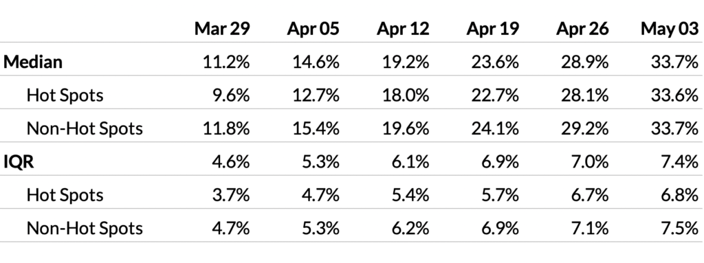
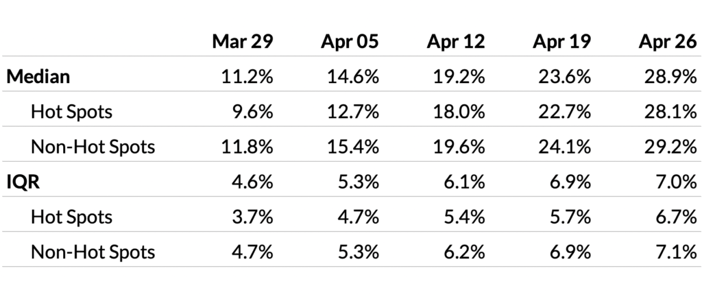
April 30 Update
Overall, the percent of residents vaccinated with at least one dose increased from 23.6 percent to 28.9 percent (median) over the most recent week in Ontario. And the gap between postal codes designated as hot spots and those that are not has continued to narrow: 28.1 percent versus 29.2 percent, respectively, when comparing the median.
The widening variation among postal codes observed over recent weeks has slowed down considerably, as measured by the interquartile range (IQR). However, among hot spots, variation has actually increased. This is likely due to focused vaccination efforts in some but not all hot spots, due to limited vaccine supply. More about this below when I discuss movers of the week and postal codes of concern.
Movers of the Week
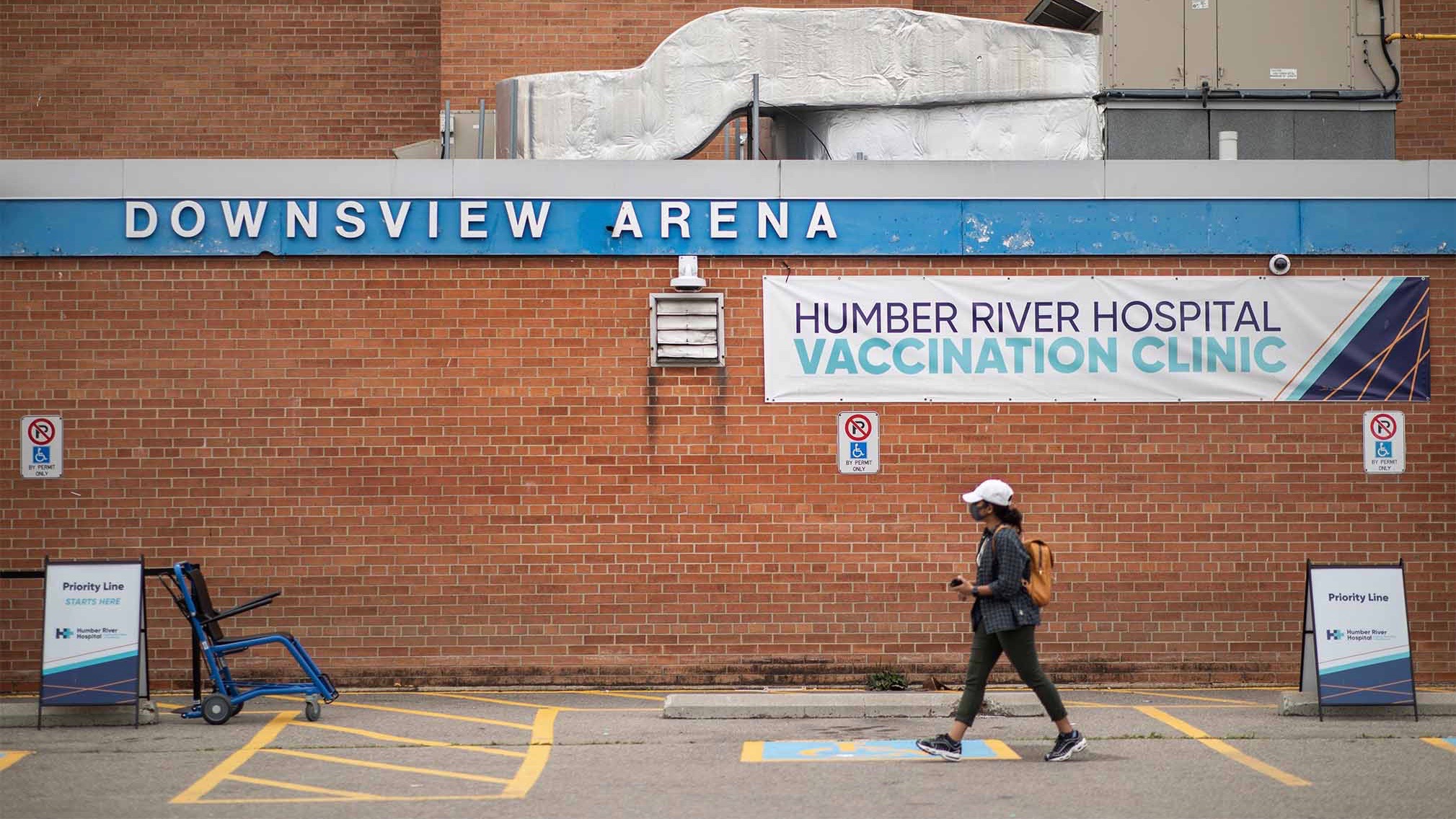
M3J, M3L, M3M, M3N: So much progress has been made over this past week, it’s hard to have just one mover of the week. In the scatterplot above (slide 3 of 5), we see that several postal codes along the Jane Street corridor shifted dramatically to the right: M3J (Keele-Finch), M3L (Jane-Sheppard), M3M (Jane-Wilson), and M3N (Jane-Finch). This is the second week in a row that Jane-Finch has been a mover of the week, owing largely to pop-up and mobile clinics that have continued to be set up at various locations throughout the area, including at the Driftwood Community Recreation Centre and the apartment buildings at San Romanoway. However, the biggest contributor to all four postal codes making these gains has to be the decision by Humber River Hospital to abandon appointment booking at Downsview Arena starting April 20, essentially turning it into a low-barrier pop-up clinic for anyone over 18 in the surrounding postal codes. It was a bold decision that’s paid off.
Postal Codes of Concern
M1X, M6M, M9M, M9N, M9V: Progress has stalled in several postal codes with high rates of COVID infections. These include M1X (Neilson-Morningside/Scarborough), M6M (Keele-Eglinton), M9M (Weston-Sheppard), M9N (Jane-Lawrence), and M9V (Kipling-Finch/Rexdale). These areas are heavily populated by racial minorities and low-income individuals who work in essential industries.
Toronto’s northwest has gotten a lot of attention lately, so let’s talk M1X in Scarborough. It’s the area immediately north of Malvern (some locals might even consider it to be part of Malvern). Individual income here is $33,432 (pre-tax), which is significantly below the median of $52,255 for all Toronto postal codes. It’s very likely that a significant portion of the population works in essential jobs. M1X is also home of the City of Toronto’s only Amazon fulfilment centre (known as YYZ9). This massive warehouse has been in active outbreak for nearly a month, the city’s largest, with 38 COVID cases and counting. It seems sensible to me that all residents and essential workplaces of M1X should have immediate access to the vaccine.
Peel: Postal Codes of Concern
Peel continues to lag behind the province for vaccination, especially in hard-hit areas like L6P, L6R, L4T, L6X, and L7A. These postal codes continue to move upward (meaning infections are rising) while a significant proportion of residents continue to be unvaccinated. More about this on Monday, with another deeply-reported story by Fatima Syed about Peel’s vaccination efforts.
***
April 23 Update
In early April, the Ontario government released a list of 114 “hot spot” postal codes for priority vaccination. According to the government, individuals aged 18 and over in designated hot spots are eligible for vaccination through mobile teams and pop-up clinics.
Since then, there has been considerable debate about the merits of several postal codes—some neighbourhoods at higher risk of COVID have been excluded while lower risk ones have been included. My view is that these debates lose meaning with each passing week due to the rapidly evolving nature of risk and immunity; a high-risk neighbourhood from eight weeks ago might no longer be high risk if a significant portion of the population has been vaccinated.
If the intention is to vaccinate the highest risk neighbourhoods first, then there is a need for more real-time, dynamic prioritization. This requires some understanding of a neighbourhood’s propensity for COVID infections (based on cumulative cases per capita), as well the degree of protection it has from the virus (percent of residents vaccinated). See scatterplot below.
The best use of an incremental dose of available vaccine is in moving postal codes in the upper left to the right as quickly as possible. That will avoid the most infections, hospitalizations, and deaths. As new data are released by ICES each week, I will be updating this blog to help track these moving targets
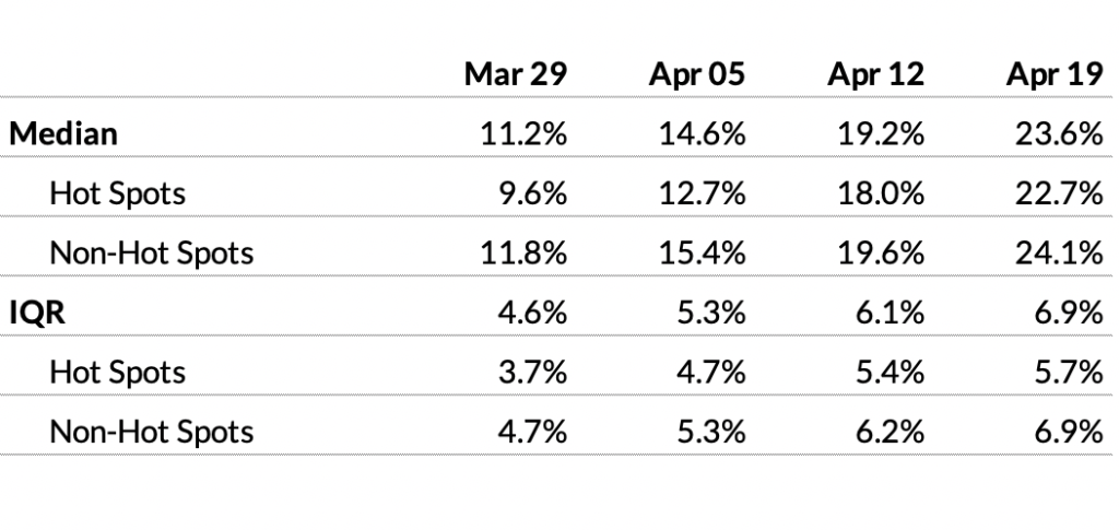
Overall, percent of residents vaccinated with at least one dose increased from 19.2 percent to 23.6 percent (median) over the most recent week in Ontario. And the gap between postal codes designated as hot spots and those that are not is closing: 22.7 percent versus 24.1 percent, respectively, when comparing the median.
However, variation has widened with each passing week, as measured by the interquartile range (IQR). This means that the gap between under-vaccinated and over-vaccinated areas is increasing, and has been since measurement began on March 29. The variation in Toronto is especially pronounced (see scatterplot for Toronto).
Mover of the Week
M3N (Jane-Finch): Over the most recent week, this neighbourhood in Toronto’s northwest went from 11.8 percent to 20.4 percent vaccinated. On the Toronto scatterplot, look at the speed with which this dot moves from left to right in the most the recent week. That’s what we want to see for all the high-risk postal codes. This progress is due largely to last weekend’s pop up vaccination clinic, which administered 3,140 doses to M3N residents, the majority of whom were Black and Vietnamese Canadians.
Postal Codes of Concern
M9V (Kipling-Finch/Rexdale), M9M (Weston-Sheppard/Humbermede): These two postal codes have high rates of COVID infections and very low vaccine coverage relative to the rest of the city. They’re also heavily populated by racial minorities and low-income individuals. On April 21, the City of Toronto announced a plan to “triple vaccine access in 13 hot spot neighbourhoods,” including M9V and M9M. We’ll have to wait until next week to see whether or not that’s made a difference in terms of moving these dots to the right.
Peel
Earlier this week, Fatima Syed wrote an in-depth feature about how Peel has been neglected at every step of the pandemic, including how under-vaccinated it is. Peel currently accounts for 20 percent of all cases in Ontario, yet they’ve only received 7.5 percent of the vaccines. The scatterplot shows five postal codes of concern in Peel that warrant attention: L4T (Goreway-Rexdale), L6P (Goreway-Castlemore), L6R (Bramalea-Sandalwood Parkway), L6X (Chinguacousy-Williams Parkway), and L7A (Hurontario-Bovaird).
The Local’s ongoing vaccination coverage is made possible through the generous support of the Vohra Miller Foundation.
More from this issue
Different Schools, Different Risks
A one-size-fits-all-approach hasn’t worked at any stage of the pandemic. Why do we think it will work in schools this year?
What Convinces A Person to Get Their First Shot?
A new survey from The Local and Humber River Hospital reveals a multitude of reasons people delayed their vaccine and one big reason they finally got it.
The Missing Middle
Middle-class neighbourhoods haven’t been the focus of accelerated vaccination. Now they’re home to more than half a million under-vaccinated Torontonians.
The Last 25 Percent
Almost three-quarters of Toronto adults have received their first vaccine. Next comes the hard part.
Second Doses Missing Those Who Really Need Them
With the Delta variant making second dose distribution urgent, new data reveals Toronto’s highest-risk neighbourhoods are being left behind.
Community Ambassadors Are the Link to Toronto’s Unvaccinated Populations
As vaccination rates plateau, a new army of outreach workers is canvassing pockets of the city missed by the initial rollout.
Why Haven’t Primary Care Doctors Been Part of the Vaccine Rollout?
Sometime soon, responsibility for vaccinations in Toronto will need to shift to primary care doctors. Is there a plan?
“We Had to Save Ourselves”
When the pandemic hit Peel, it wasn’t the government that stepped in, but an army of citizens that mobilized to feed their neighbours, set up pop-up clinics, and demand better for their community.
Getting Vaccinated in the Holy Month
This year, we thought we’d figured out how to do Ramadan in a pandemic. Then the vaccine rollout began.
Vaccinating Black Toronto
The city’s Black communities has been disproportionately affected by COVID. Now these physicians and community leaders are working to make sure they don’t also go unvaccinated.